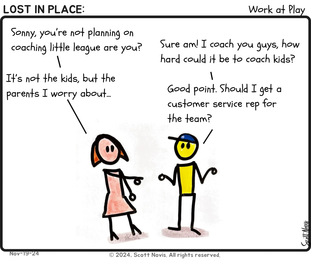
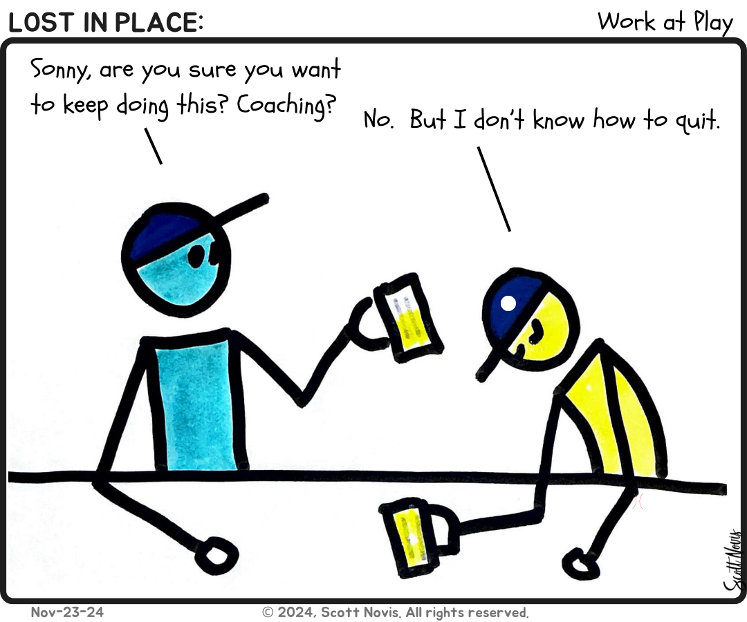
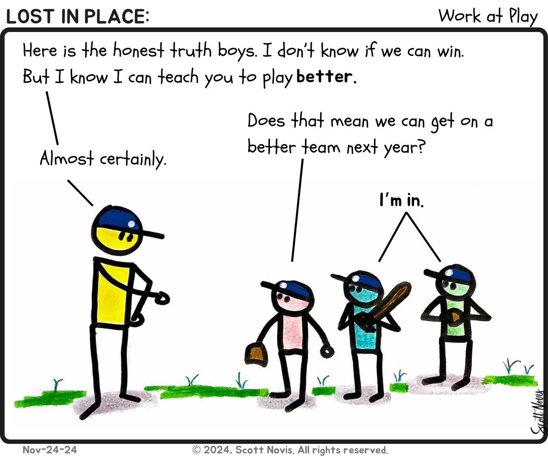
This week marks an interesting shift. I realized that I was giving a lot of visual space over to non-content. Here's the comparison.
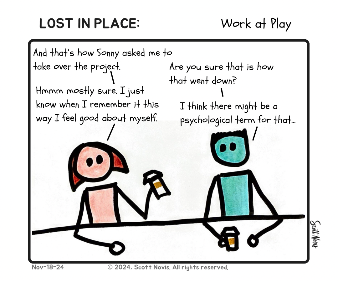
The first rendition gives white space to the title, my signature is outside the frame, and it forced the text to be smaller (24 point font). But who cares about that stuff?
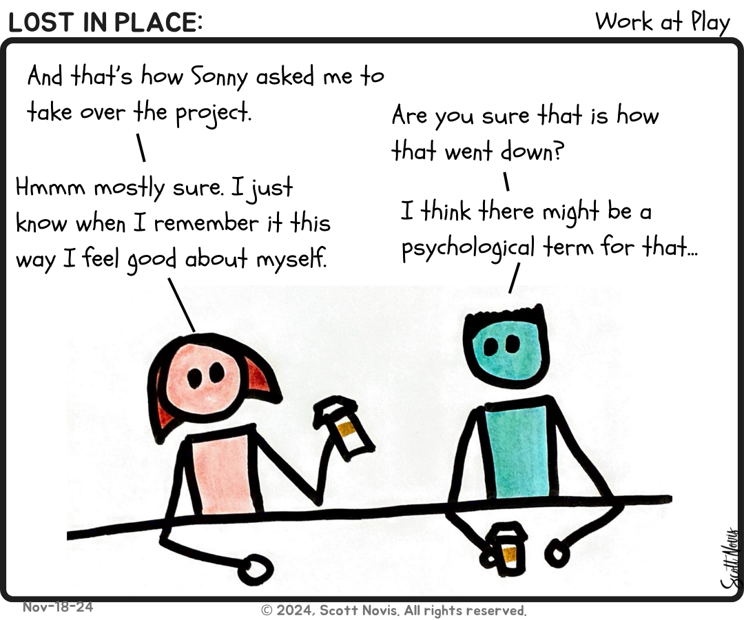
By giving more space to the content, I could increase the font to 28pt and have more room to draw. So that's what I did.
Baseball
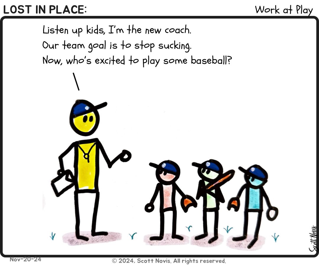
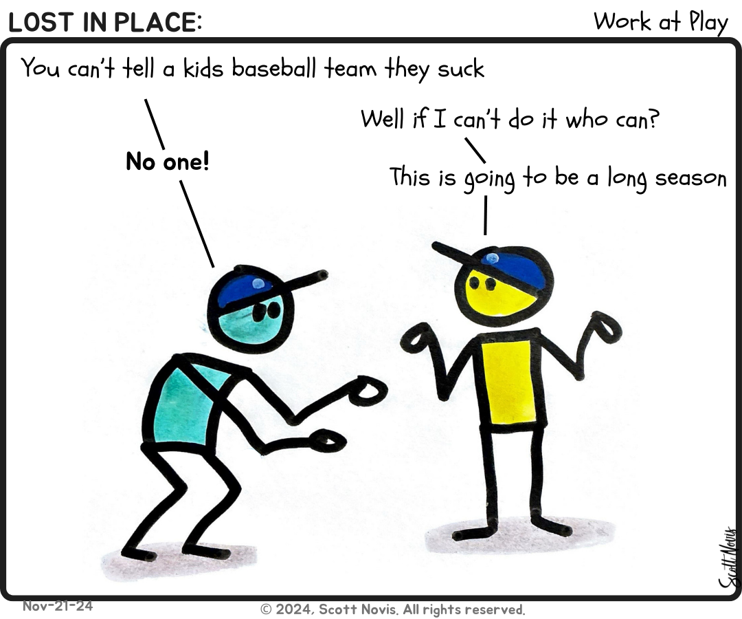
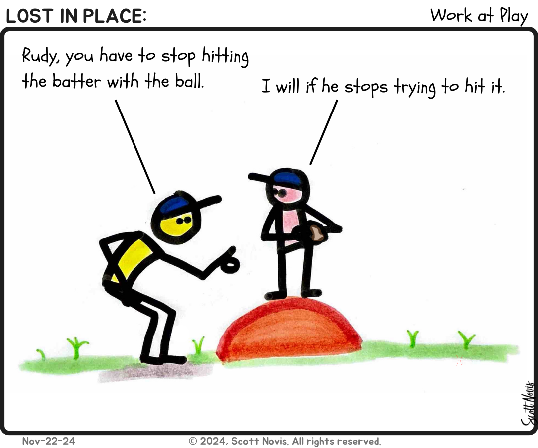
Then my sister suggested I take some of my baseball lessons and put them in comic form. I found it intriguing... I mean, how hard could that be? Uh... harder than I thought. This also marks the point where I stopped using Notability or the Remarkable to make comics and focused heavily on markers on paper. I felt like I got smoother lines, and I like the color better. What I do is rapidly prototype a story idea digitally, then I draw it out by hand. I don't know why.
